Saturday, March 26, 2011

Australian Vogue Living Colours


I am in the middle of a love affair with the colours in this apartment I saw in the March/ April Australian Vogue Living. PURPLE>ORANGE>GREEN>GREY>GOLD....so beautiful, I want to make a painting for our apartment using these colours. This fling could easily turn into a serious relationship. 

xK

Tuesday, March 22, 2011

Balcony Thoughts

I read the archives of Lonny today. Yep. All nine of them. 
I've seen so many images that they have all melded together into one confusing mess.... however, the one below has managed to stand out in my mind. This table and chair set up could work really well on our balcony, which is about the same size. I guarantee I saw a MILLION tables like this over summer when I checked out every antique/junk shop between Melbourne and Port Fairy and I have always liked Tolix style chairs....


I was also thinking of some big wicker chairs in kitschy colours like mint green and baby pink, maybe at the other end of the balcony? I swear I saw some at Fenton and Fenton when I drove by recently. I just tried to google 'kitsch wicker furniture', but I couldn't find what I'm thinking of. What's in my head is similar to this B&B Italia chair below...


xxkiki

Sunday, March 20, 2011

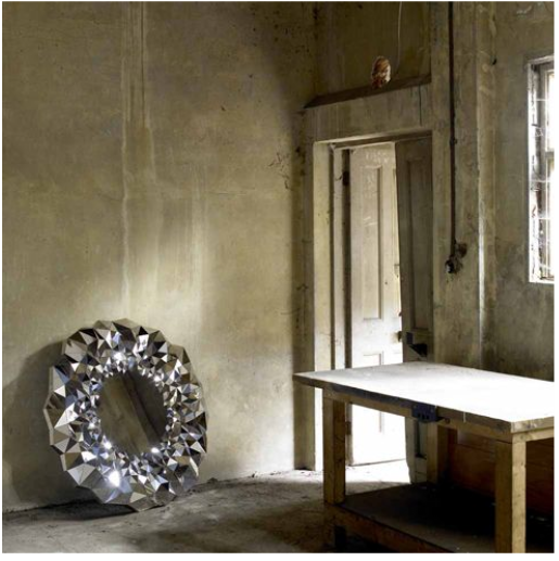
Stellar Mirror AKA Engagement Mirror

I'm thinking I should have got this diamond inspired mirror for my engagement instead of a ring. Not really, I love my ring....this mirror is just so stunning!


Made from 750 individually sized and angled mirror sections, the Stellar mirror is by Jake Phipps


In the video below, you can see how the mirror catches the light and sparkles...just like a real diamond. 


If I have convinced anyone to consider an engagement mirror instead of a ring, get in quick there were only 25 of these made....

x kiki

Saturday, March 19, 2011

Whimsical Bathroom

A space that "literally comes alive" is not the aim of most when renovating a bathroom in a late 19th century house. However, that is exactly what Dutch designers Bo Reudler Studio endeavoured to do in this home near Amsterdam. They achieved this by mimicking natures organic forms and using materials, such as copper, that show traces of time and usage.


The tiles seem cracked, but the cracks are actually growing from the sources of water to become trees from which flowers bloom. As with the rest of the copper work, the flowers will age over time taking on a greenish tinge.  


The hot and cold water pipes will age differently due to condensation build up on the copper surface. I find this fascinating! 


Built especially for this bathroom, but part of the designers 'Slow White' collection, this sink is made of curved branches gathered from the forrest and painted white. The mirror is made to look like a pool of rippling water, which looks very pretty, but I'm not sure how practical it is! 

Clearly a lot of thought has gone into this bathroom, it is in no way traditional, yet there is such a sense of history - and the notion of time passing is present throughout. Sometimes lots of deep and meaningful thought behind decorating and design can make me feel sick, this bathroom though manages to get away with it, perhaps because it is so fanciful and pretty.  


xx Kiki 

PS. Will has started painting! 

Thursday, March 17, 2011

Paris Pied-A-Terre

Behold, the Paris of your dreams. That is, if you dream about a 19th century apartment in the 7th Arrondissement filled with striking furniture and art - I know I do. This dream is a reality for business partners Steven Volpe and Roth Martin, who come to Paris on buying trips for 20th century furniture and art gallery Hedge in San Francisco. 


So Dreamy: The grey couch paired with the velvet orange cushions. 


So Dreamy: Arik Levy stainless steel rock tables. 


So Dreamy: Brass mirror circa 1950, in the powder room. 


So Dreamy: The view of the Eiffel Tower through the window. 

I'm off to bed, most likely I'll be dreaming about Paris, this apartment and spending my days "hunkered down in libraries conducting research and haunting local auctions..." as these boys do. 

xx kiki 

image and info source: elledecor.com 

Lighting For The Bedroom

Inspired by the previous post, I went on a manic internet search of bedrooms with task-style sconces. 


In all the feverish haste of my search, I forgot to note where I got these images from. But I like them. A lot.


I think I'm onto a winner of an idea, now I just have to find out where to get something like this. 


Perhaps Industria in Fitzroy, or somewhere similar. 

x k

Tuesday, March 15, 2011

Bronze/Brass

I'm having a bronze/ brass moment. 
I saved the first two images from emmas designblogg recently, and now everywhere I look there are bronzey brassy things calling my name. Taken from the site ArtSchoolVets in the 'Faces and Spaces' section, these first two images are from the home of  Rike Döpp. 


 If you can read German I'm sure the interview is very interesting, the rest of us will have to be content with the Selby-like imagery. I love how these mirrors are layered together, imagine the distortions and reflections of light they would create. This would be such an easy thing to try with any group of mirrors. 


The flatware below is from Anthropologie. The site claims that "Ancient artifacts and hand-hewn spear tips must have inspired the organically arched shape of this utensil set". I see there form more as scandinavian inspired, similar to Gense perhaps. Either way, I NEED at LEAST twelve place settings of these, and at AUD$37.09 for the five pieces I feel like this dream is not too large. 


For some peculiar reason, our new flat has no overhead lights in the main living/ dining area and a few of the other rooms. We can see where the lights originally were due to the patch-up job in the plaster, so some brilliant person must have gone to the trouble of removing them. Of course, this gives us the opportunity to wire lighting to the exact places we want it. I'm thinking about lights hanging down over the dining table, which is why the bronze lights in the image below (from Lonny) are making me excited. 


This shot is also from Lonny and is making me VERY excited. I know I said I NEEDED the flatware, but I think I need some task-style sconces for the bedroom even more. You see, even though wired-in lighting is minimal in some parts of our flat, the bedroom actually has sconces on either side of the bed already. Just not very nice ones. That can easily be fixed though and I think something similar to the light below is the answer. 


So much to think about! 
xx k

Monday, March 14, 2011

Choosing A White Paint

How many shades of white are there?? Just one??  Ask anyone who has chosen a white paint and they will tell you the correct answer - hundreds. Our flat is currently painted in Dulux Berkshire White, although this colour is not majorly offensive, we wanted something lighter and whiter and before we filled the place up with furniture seemed like the perfect time to paint.  


The brief seemed simple, choose a cool white that didn't have any blue undertones. The reality, a different story. We stuck to the tried and true brand of Dulux; looking at multiple shades of white as well multiple brands of paint seemed too confusing to contemplate.


Going to Bunning’s and grabbing all the white colour samples, we tried to imagine what the little bits of cardboard would look like if they were a lot bigger and on our walls.  This proved to be a tricky task (even after a sausage from the sausage sizzle)  we needed the sample pots of paint to take home in order to make an informed decision. 


After some quick iphone research, we decided to get a sample of Natural White (apparently meant to be a little lighter then Antique White USA) and Lexicon ¼ (a gray based white). 


Once we were home and multiple walls had been painted in both the samples, it was decided that Natural White wasn’t that much lighter then the Berkshire White that is currently there…so the winner must be Lexicon ¼!!

We are happy with this choice at the moment and hopefully painting shall commence soon, although I wouldn’t be surprised if I change my mind ten times before the first coat goes on!

(The images interluded between the text are of Alexander Wang's office in Manhattan, photographed by Todd Selby. Yay for white walls and chesterfield couches. Boo for the first photo being shot wonky...love the shot but it irritates me SO much how it isn't straight). 

xx kiki